zendit Product Demo

Brand Identity


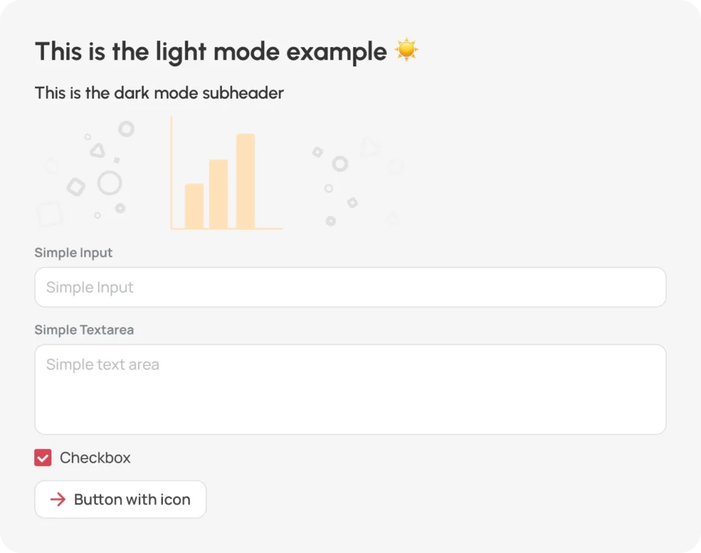
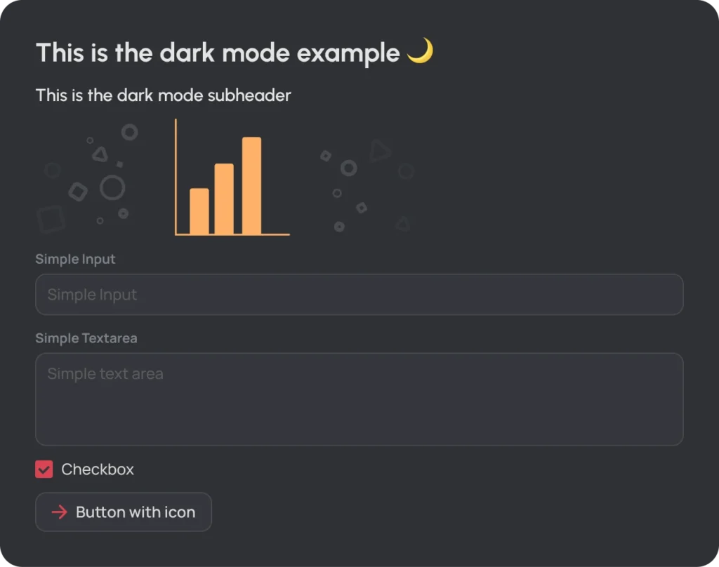
We try to convey our ideas with the languages that are clear and easy to understand for everyone, and we are supporting this with the help of illustrations and animations.
*too long; didn’t read

Naturally we don’t use soulless corporate imagery.
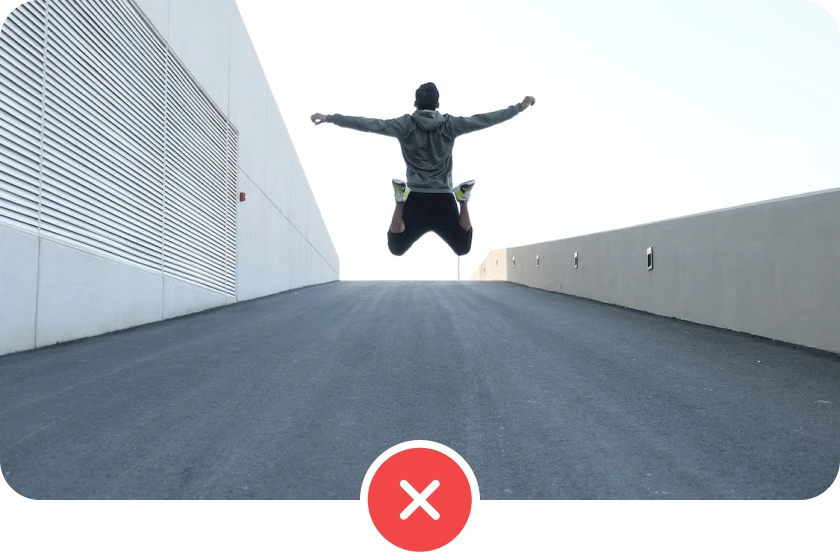
We don’t use stock images that mean nothing. (aka. Stock image abuse)

We try and rely on illustrations and animations.


If you don’t want a single logo but all of them in one zip file, click the button below.
Download all logo variations


Pay attention to the contrast and readability. Prioritize using the default logo, especially the zendit icon.


Use these colors, combinations and variations to create any presentation you like.
Cherry red

Charcoal
Vanilla

Primary-6 is the main color. Click on any box to copy the color code.
Primary-1
#FFF1F0
Primary-2
#FFF0F0
Primary-3
#FEC9C9
Primary-4
#F2999C
Primary-5
#E66C74
Primary-6
#D94453
Primary-7
#B32E40
Primary-8
#8C1D30
Primary-9
#661021
Primary-10
#400A16
Warning-6 is the main color. Click on any box to copy the color code.
Warning-1
#FFF9F0
Warning-2
#FFF3E3
Warning-3
#FFE0BA
Warning-4
#FFCA91
Warning-5
#FFB169
Warning-6
#F6903D
Warning-7
#CF6E29
Warning-8
#A85019
Warning-9
#82360D
Warning-10
#5C2308
Info-6 is the main color. Click on any box to copy the color code.
Info-1
#F0F5FF
Info-2
#D1E0FF
Info-3
#A8C2FF
Info-4
#7EA0FC
Info-5
#5176F0
Info-6
#294DE3
Info-7
#1934BD
Info-8
#0C1E96
Info-9
#030E70
Info-10
#01064A
Success-6 is the main color. Click on any box to copy the color code.
Success-1
#F0FFF7
Success-2
#D9FFED
Success-3
#A7F2D2
Success-4
#7AE6BA
Success-5
#50D9A7
Success-6
#2BCB95
Success-7
#1BA67C
Success-8
#0E8061
Success-9
#055946
Success-10
#033329
Error-6 is the main color. Click on any box to copy the color code.
Error-1
#FFF2F0
Error-2
#FFF0ED
Error-3
#FFCAC4
Error-4
#FFA29C
Error-5
#FF7773
Error-6
#F14747
Error-7
#CC3136
Error-8
#A61F28
Error-9
#80121D
Error-10
#590C16
Kate-6 is the main color. Click on any box to copy the color code.
Kate-1
#E6F9FF
Kate-2
#B0E9FF
Kate-3
#87D9FF
Kate-4
#5EC7FF
Kate-5
#33ABF5
Kate-6
#0C8CE9
Kate-7
#006BC2
Kate-8
#00509C
Kate-9
#003975
Kate-10
#00244F
This set is used for system elements, typography and reusable blocks across our platforms.
White
#FFFFFF
Table Header
#FCFCFC
Background
#F6F6F6
Divider
#F2F2F2
Border
#E0E0E0
Disabled
#BCBEC5
Secondary
#7F828A
Primary
#444444
Title
#333333
This set is used for system elements, typography and reusable blocks across our platforms.
Black
#000000
Table Header
#33353C
Background
#35373C
Divider
#3C3E44
Border
#494B50
Disabled
#5C5C5C
Secondary
#7F828A
Primary
#D7D7D7
Title
#E4E4E4
Be mindful of the colors and contrast


Urbanist


Manrope

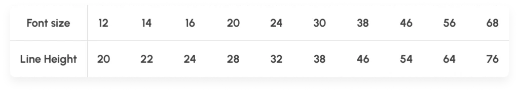
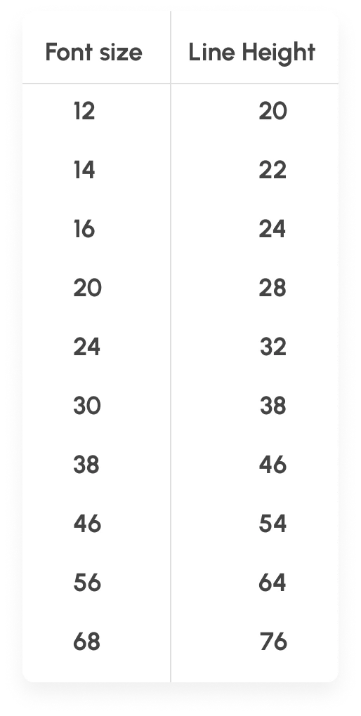
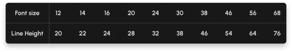
Notice: We do not change the size of our body font. It’s always fixed on all platforms to whatever device default is.
Display 1
font-size: 64px / 4 REM line-height: 1.125
Display 2
font-size: 50px / 3.125rem line-height: 1.16
Display 3
font-size: 42px / 2.625rem line-height: 1.19
font-size: 36px / 2.25rem line-height: 1.22
font-size: 30px / 1.875rem line-height: 1.26
font-size: 24px / 1.5rem line-height: 1.33
font-size: 20px / 1.25rem line-height: 1.4
font-size: 16px / 1rem line-height: 1.5
font-size: 14px / 0.875 REM line-height: 1.3
Display 1 mobile
font-size: 50px / 3.125 REM line-height: 1.16
Display 2 mobile
font-size: 42px / 2.625 REM line-height: 1.19
Display 3 mobile
font-size: 36px / 2.25rem line-height: 1.23
font-size: 28px / 1.75rem line-height: 1.28
font-size: 24px / 1.5rem line-height: 1.33
font-size: 22px / 1.375rem line-height: 1.36
font-size: 18px / 1.125rem line-height: 1.36
font-size: 16px / 1rem line-height: 1.44
font-size: 14px / 0.875 REM line-height: 1.3


Primary color is the dominant color used in our icons.


Please try to use the illustrations in your materials. No stock image abuse.
Get all zendit illustrations
Stick to this presentation template and it has variations inside.
Get zendit presentation
From marketing to print materials are all collected here, make sure you have access.
Get all zendit materialsPs. you either need to ask @don.kutbay in slack for access, or have an idt email address.
